Client:
Bigger
An article that illustrates how important it is to align verbal and visual branding.
We though BIGGER was about power and strength. While it was all about innocence and big dreams. BIGGER – align name and visual
People can have different understanding of the same company name. A name came with stereotypes, interpretation, preconception. Visual branding helps to complement these names and words, completing the understanding.
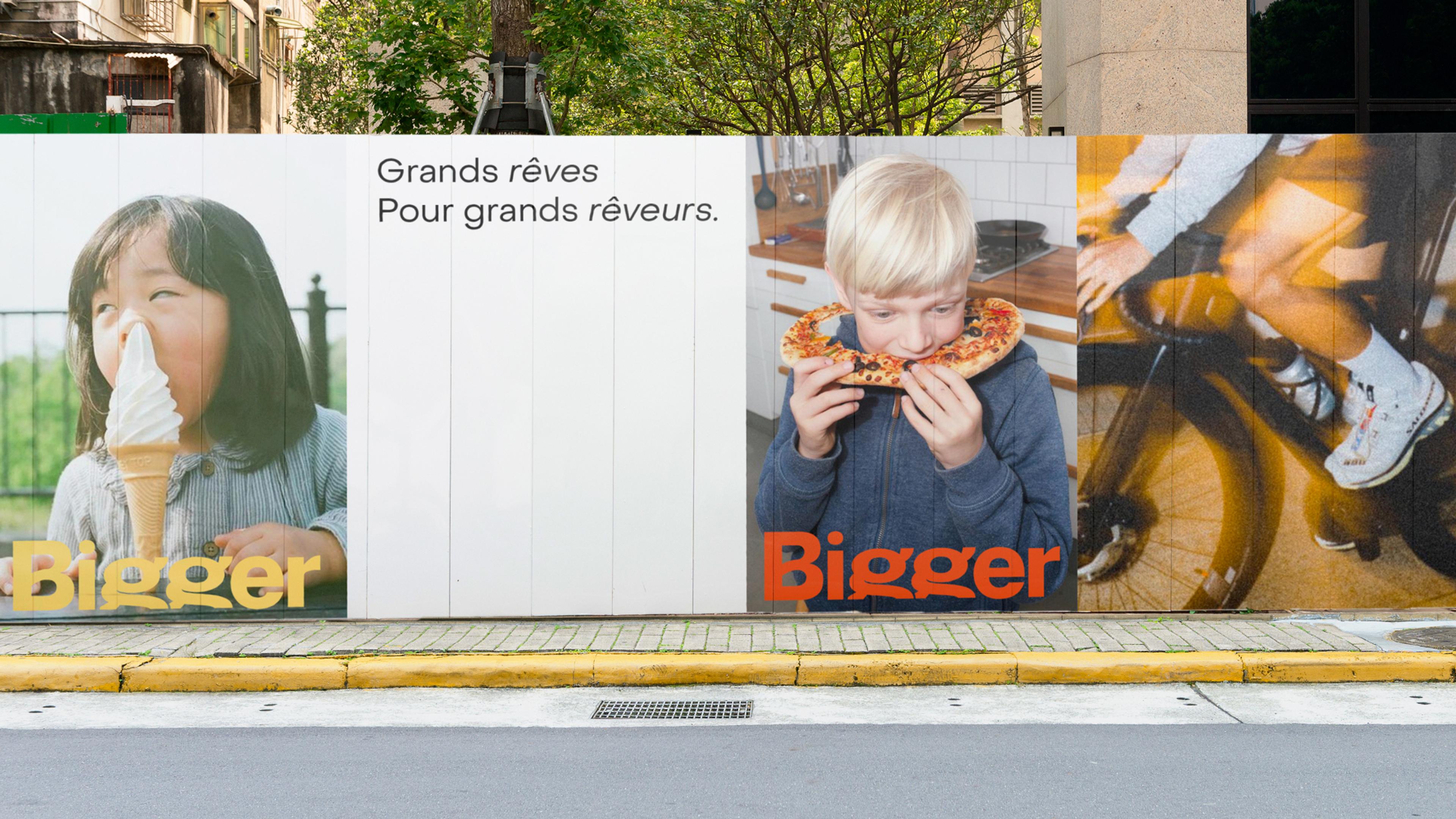
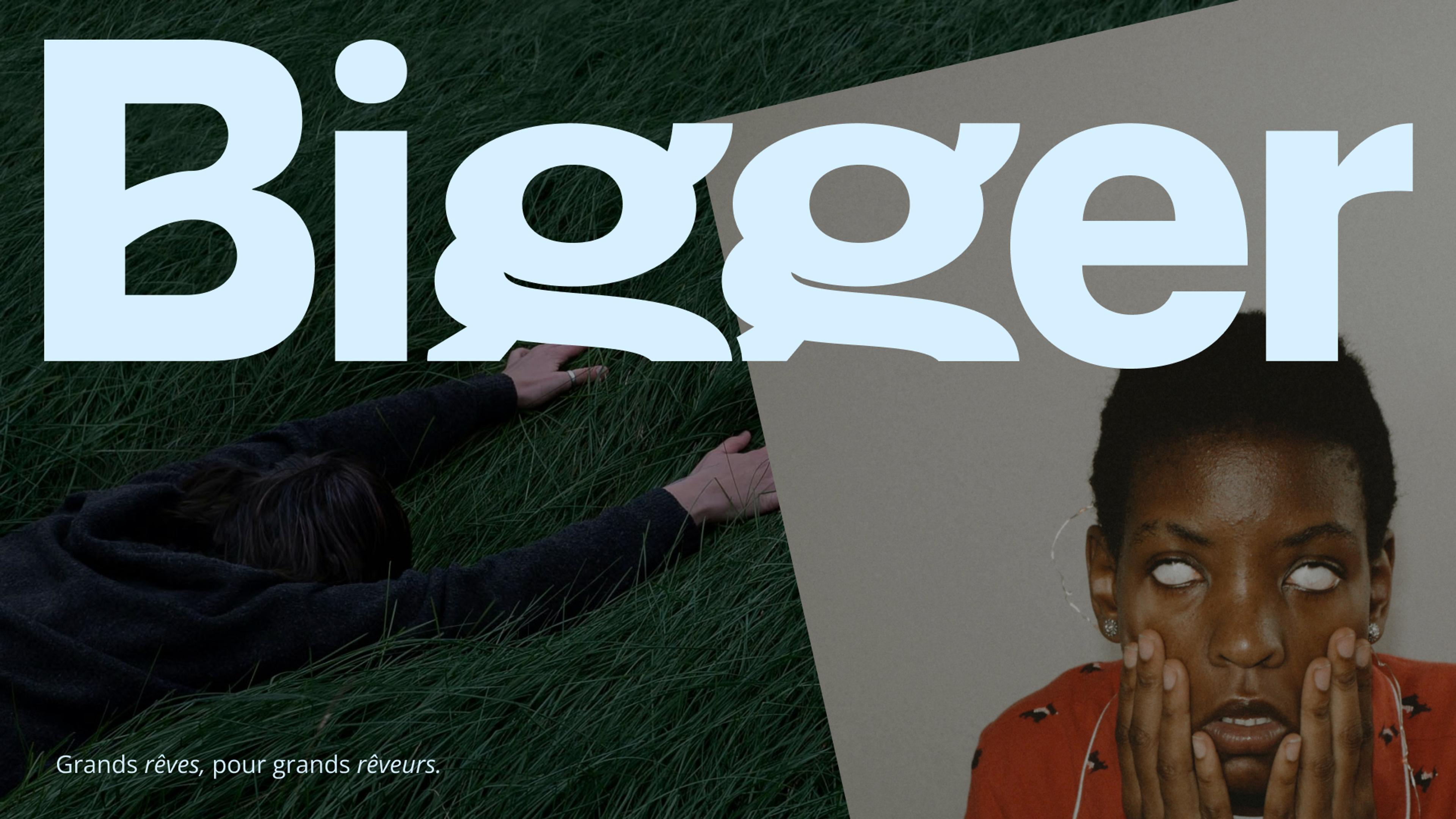
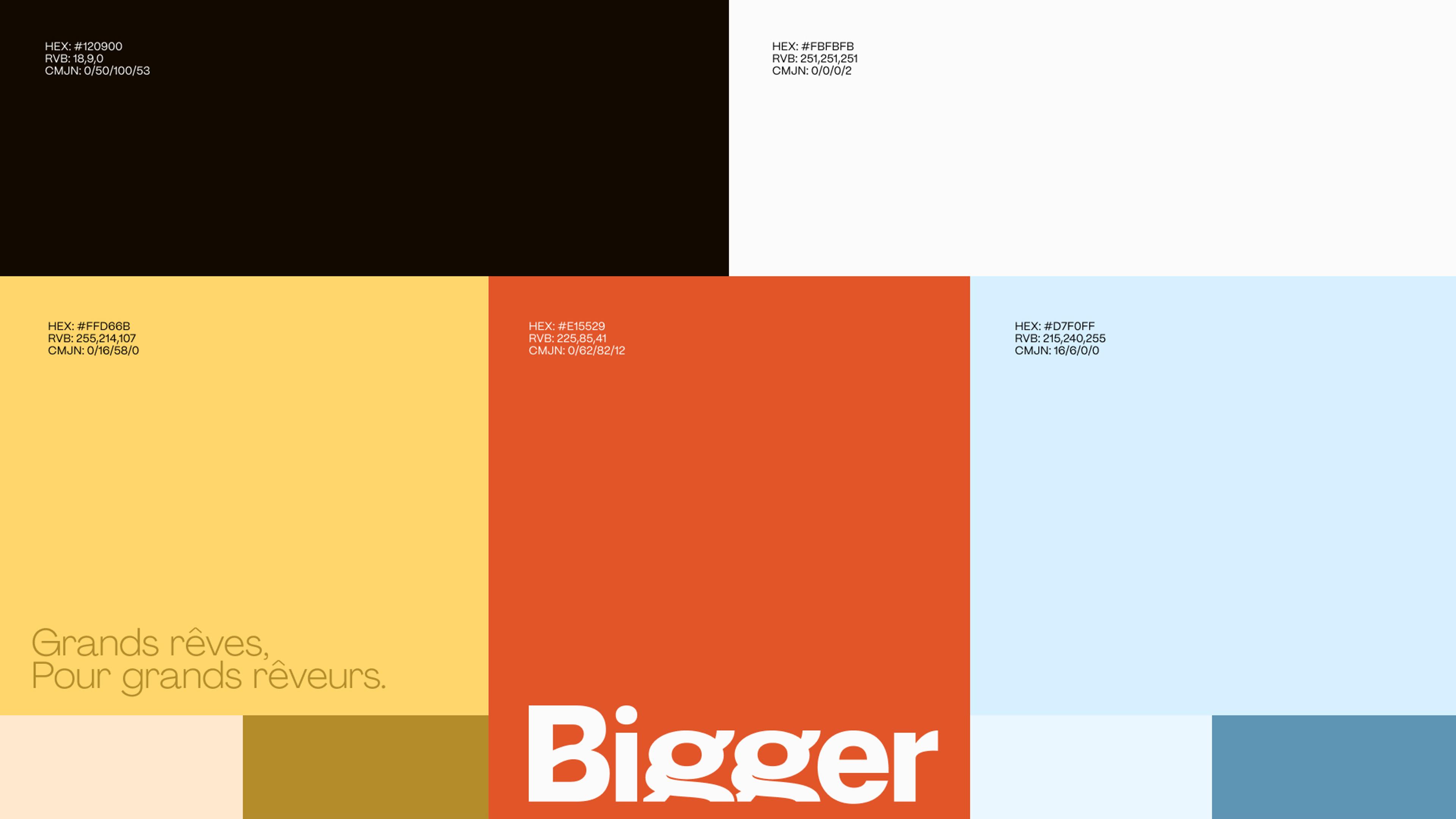
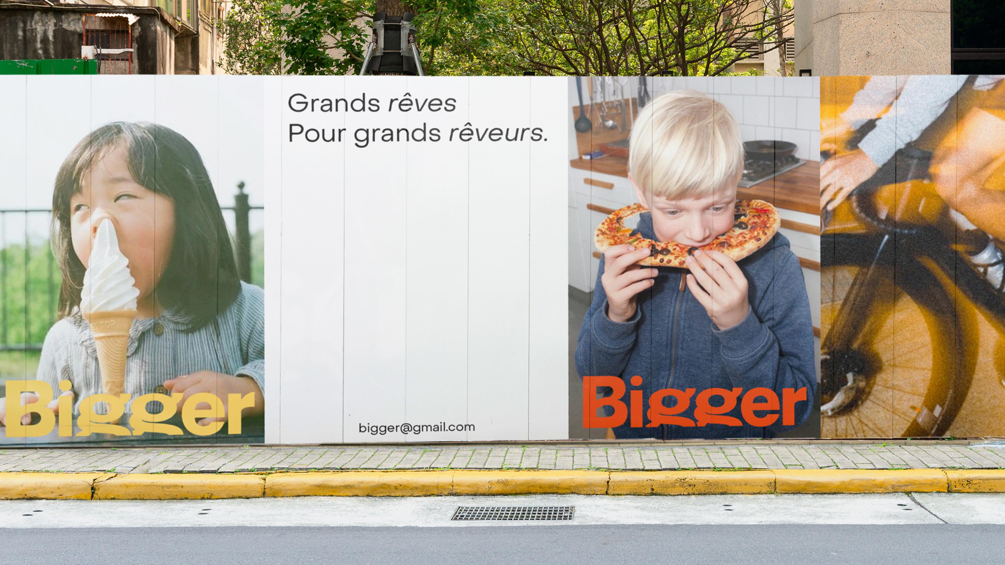
BIGGER tasked us to craft their visual identity. The mission was clear: create a visual identity for a newborn consultancy firm, that would illustrate its diverse skills, abilities to innovate, and its vision for the world: “grands rêves pour grands rêveurs” (literally “big dreams for big dreamers”).
We could have chosen simplicity and go for a design that illustrates our initial understanding of the name: BIGGER. We might have used big, bold and capital letters, combining strong and plain colors to illustrate power and strength. But we realized there was a disconnect between this approach, and the company we were working with.
After discussing the reasons behind the choice of the name and the tagline, we figured out BIGGER wasn’t meant to express power, strength, and ambition. Instead, BIGGER was a call and a statement for thinking big and dreaming the world differently. So, we aligned our proposal with this perception:
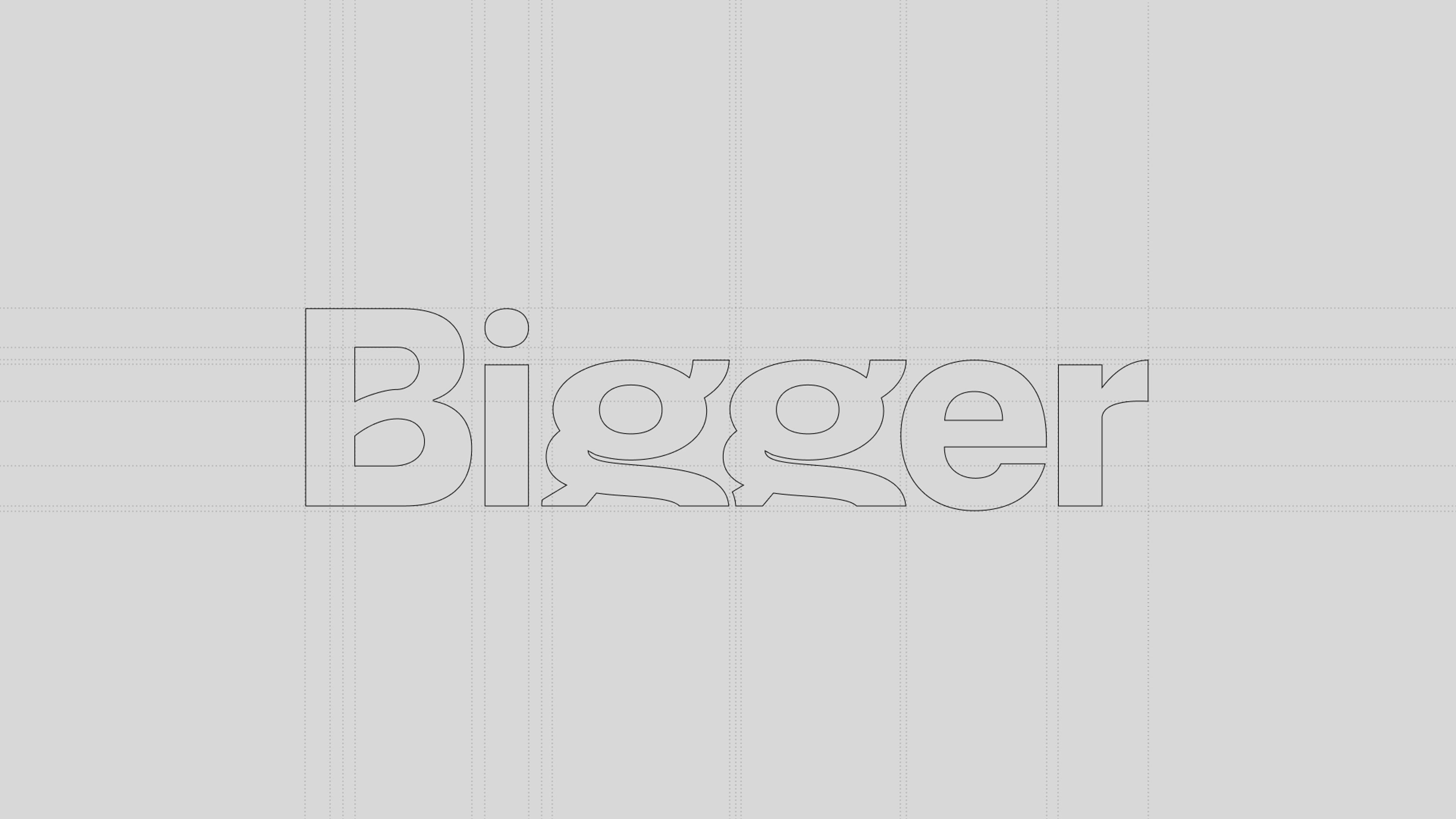
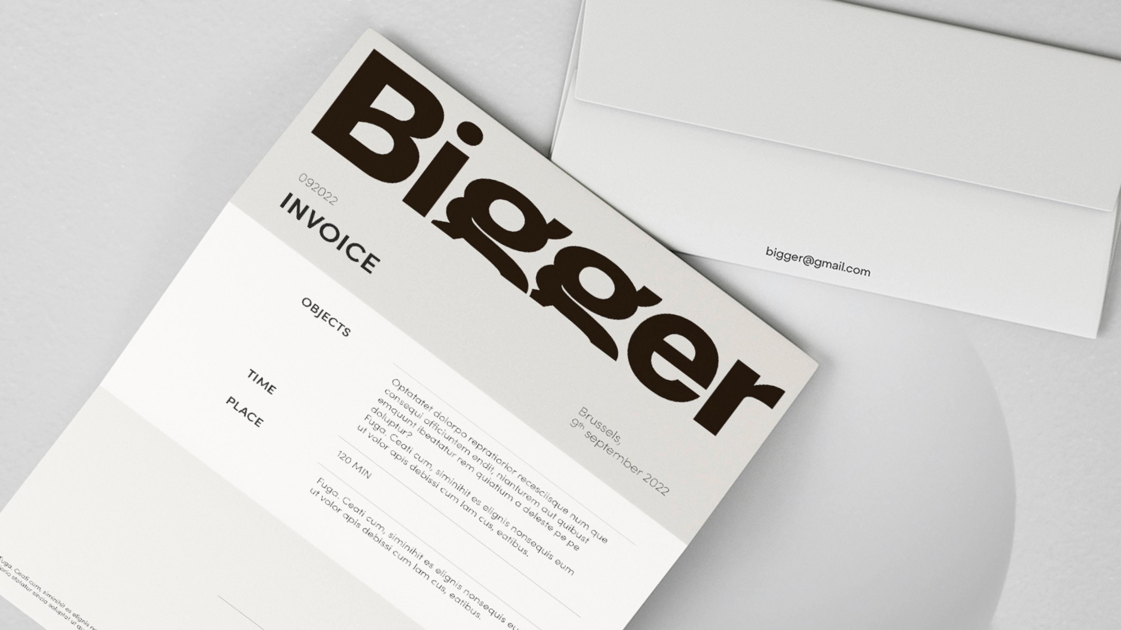
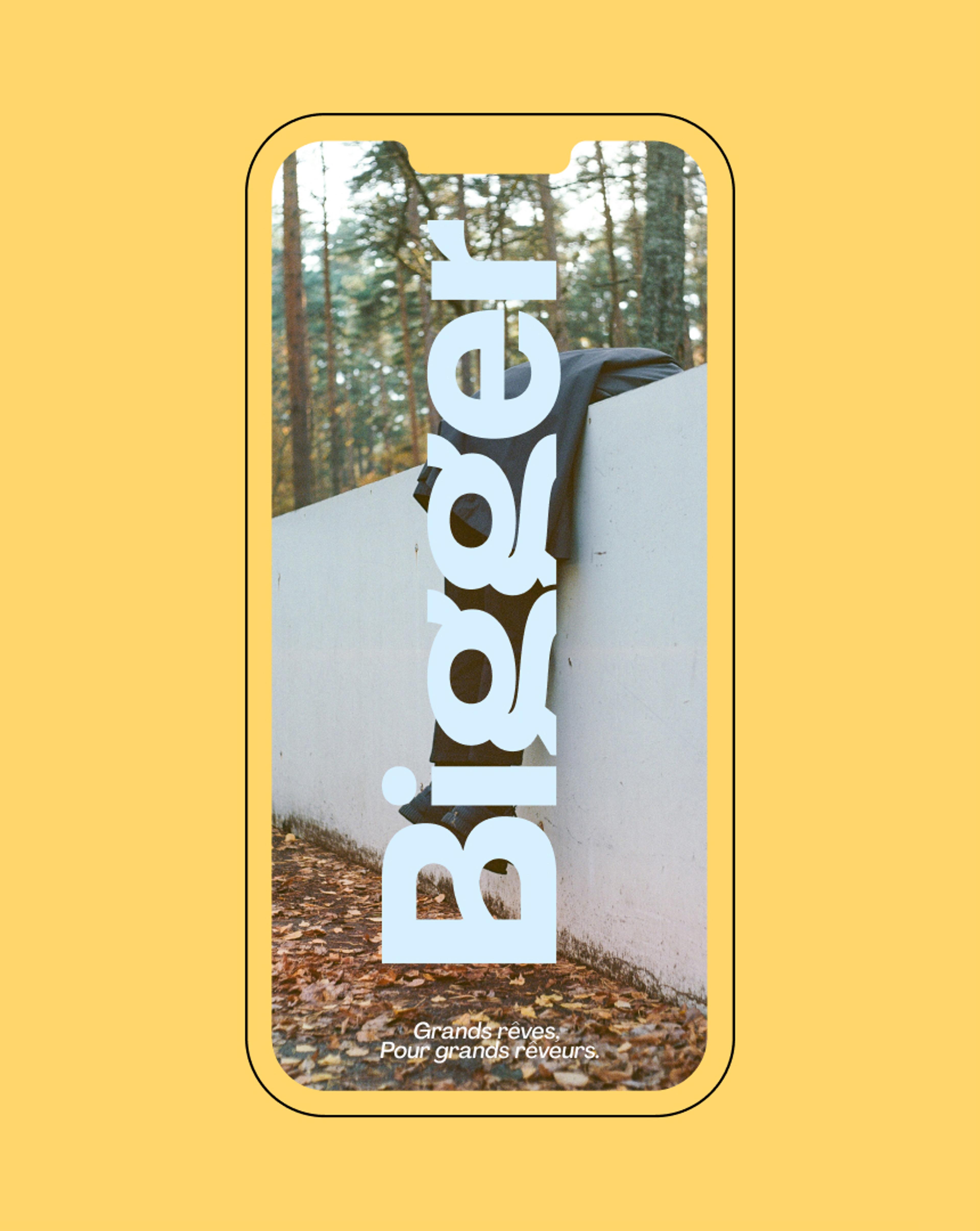
- Instead of using capital font, we decided to play with low case, and twisted the letter “G” to make it look bigger than the frame. It captures the essence of thinking beyond boundaries. We also twisted the letter B, to make it softer and more elegant.
- The color palette brings a lot of softness in the visual, contrasting with the strength of the name.
- The imagery shows a certain insouciance, that illustrate the tagline and vision – grands rêves pour grands rêveurs. This choice reinforces the optimistic nature of the brand and its commitment to fostering creativity and innovation.
Overall, the resulting visual identity reflects a delicate balance between strength and softness, insouciance and professionalism, and an obvious capacity of thinking out of the box.